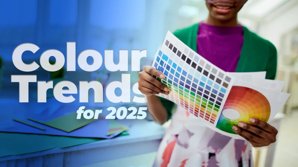
As we move into 2025, colour trends in print and branding are all about combining bold visuals with sustainability and a refined aesthetic. At AAC, we pride ourselves on being at the forefront of print innovation, particularly in the hospitality and events industry where wristbands, ID cards, lanyards, and signage are critical to creating memorable experiences. Our unique manufacturing capabilities, including full-colour, locally produced prints, enable us to help brands embrace the latest colour trends while supporting sustainable practices through eco-conscious products like our EcoBands and RPET fabric wristbands.
In this extensive guide, we’ll dive into the colour trends shaping branding and print for 2025, offering insights into how you can apply these trends across your event marketing, promotional materials, and printed collateral. Whether you’re a festival organizer, a corporate event planner, or a hospitality brand, understanding these colour dynamics will ensure your visual identity stands out.
1. Bold and Electric Colours: The Rise of Saturation
2024 has seen a surge in bold, high-saturation colours—think cobalt blue, electric lime, and neon yellow. These shades are perfect for grabbing attention, making them ideal for event wristbands and signage. And in todays attention deficient age, we definitely think this will continue. At AAC, we can help your brand stand out in a crowded space by applying these vibrant tones to our full-colour print wristbands or event signage.
Why It Works:
Psychology of Bold Colours: These saturated shades stimulate excitement, urgency, and energy—making them ideal for brands looking to create an immediate impact.
Want to Use this Colour Scheme?
Pro Tip: Use these colours in high-visibility areas. For example, use a bold blue or neon yellow on wristbands, lanyards, or event banners where attendees will immediately notice them.
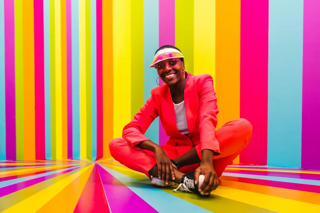
For example, a music festival might choose neon-coloured wristbands to ensure staff and security can quickly identify attendees in large crowds, while the vivid colours add an element of excitement to the overall event branding. Our customizable lanyards can also feature these bold hues to reinforce brand visibility, ensuring attendees feel like they’re part of something dynamic and fun.
2. Sustainability Meets Earthy Tones: Green Is Still King
With sustainability more relevant than ever, we’re seeing an increase in earthy tones like moss green, terracotta, sand, and muted blues. These colours connect with nature and sustainability—a crucial aspect for brands focusing on environmental responsibility. EcoBands, our biodegradable wristbands, come in various earthy tones that align with eco-conscious brands and events.
Why It Works?
- Psychology of Earthy Colours: Green is strongly associated with health, balance, and nature, while other muted tones like terracotta or sand ground a brand in reliability and sustainability.
- Sustainability Is Key: As consumers prioritize eco-consciousness, brands using earth tones convey a deeper environmental connection. These tones evoke the tranquility of the natural world and suggest a commitment to minimizing environmental impact.
How To Use This In Your Branding
When promoting eco-friendly events or products, our EcoBands and RPET fabric wristbands in natural, earthy tones allow brands to underscore their commitment to sustainability. A conference centered around environmental topics, for example, could use muted green wristbands to echo the themes of the event while offering a subtle, sophisticated branding experience.
We also manufacture full-colour print products in earth tones, so you can keep your materials eco-conscious without sacrificing design quality. Whether you’re creating eco-friendly event signage or using biodegradable wristbands, AAC has the tools to help your brand speak to the sustainability movement.
3. Pastels with a Modern Twist: Soft, Fresh, and Inviting
Pastels continue to play a significant role in branding, but in 2024, expect these colours to take on a fresher, more contemporary feel. Lavender, mint green, and sky blue are being reimagined to create calm, modern designs that stand out without overwhelming the audience. These softer hues are particularly appealing for industries such as wellness, healthcare, and eco-friendly brands, offering a serene backdrop for more subtle yet impactful messaging.
Why It Works:
- Psychology of Pastels: Light shades of lavender and mint green evoke feelings of calmness, freshness, and approachability. This makes them perfect for brands that aim to promote well-being, trust, or eco-consciousness.
- Perfect for Event Collateral: Pastels create an inviting and friendly atmosphere at events, helping attendees feel relaxed and connected.
How To Use It In Your Branding
AAC’s customizable wristbands and ID cards can feature pastel tones that perfectly reflect your brand’s personality, particularly if you’re in the wellness, fashion, or hospitality industry. For example, imagine a spa retreat using soft lavender wristbands or event signage to create a peaceful, welcoming environment. Pastel shades on ID cards or lanyards would convey sophistication while maintaining an approachable and warm tone.

4. Monochromatic Colour Schemes: Elegance in Simplicity
Monochromatic designs are timeless and have surged in popularity, offering a sleek and polished aesthetic. In 2024, brands are increasingly turning to single-colour schemes—utilizing different shades, tints, and tones of one base colour to create clean, elegant looks. Monochromatic colour schemes work especially well in professional or high-end settings, where minimalism and sophistication are prized.
- Psychology of Monochrome: Monochromatic schemes create a sense of order, elegance, and simplicity. They reduce visual clutter and allow key elements (such as logos) to stand out clearly.
- Perfect for Upscale Branding: This trend is ideal for luxury events, corporate branding, or formal gatherings where you want your design to be refined and cohesive.
Applying to AAC's Products:
For high-end events, our RPET fabric wristbands printed in varying tones of a single colour can add sophistication while maintaining a minimalist aesthetic. Corporate clients can utilize monochromatic tones in ID cards, badges, or lanyards to create a polished, consistent look across all event collateral. Imagine using varying shades of navy for a corporate conference, where monochromatic wristbands add to the overall sense of refinement and professionalism.
5. Gradient Designs: Bringing Depth and Dimension
Gradients, where two or more colours seamlessly blend into one another, have made a major comeback in both digital and print media. They add depth, movement, and dimension to flat designs, making them highly versatile. For event collateral, gradients are perfect for backgrounds or wristbands where you want to evoke energy and flow.
Why It Works:
- Psychology of Gradients: Gradients can symbolize transformation, fluidity, and innovation. They are often associated with creative industries, tech brands, and events that emphasize forward-thinking or change.
- Versatility: Gradients allow you to incorporate multiple brand colours without them clashing, making them an excellent choice for diverse product lines.
Imagine a tech conference where gradient wristbands—shifting from blue to purple—are used to evoke innovation and forward-thinking. Or perhaps you’re hosting a festival where the event banners feature sunset gradients from orange to pink, emphasizing warmth and celebration. AAC’s printing capabilities make it easy to apply vibrant gradients to wristbands, signage, or even event merchandise, adding a modern flair to your brand.
6. Neutrals with a Pop: Timeless Meets Trendy
Neutrals are often overlooked but are essential in any branding strategy. Beige, taupe, gray, and soft blacks offer balance and elegance, especially when paired with a brighter, more daring accent colour. This trend is ideal for brands that want to maintain sophistication while injecting a bit of fun and energy into their visuals.
Why It Works:
- Psychology of Neutrals: Neutrals provide calmness and professionalism, while accent colours add vibrancy and excitement. Together, they create an adaptable yet visually interesting brand identity.
- Timeless Yet Trendy: Neutrals are versatile and can be easily refreshed by adding pops of colour, making this trend perfect for both classic and contemporary brands.u
AAC Product Application:
If your event branding is based on neutral tones like gray or beige, you can use bright accents on wristbands or lanyards to draw attention to key areas such as VIP access or event sponsors. For example, gray lanyards with bright orange text or logos can create an eye-catching yet sophisticated look. This approach allows for flexibility in messaging while keeping the overall design grounded and elegant.
7. High-Contrast Pairings for Accessibility
Accessibility in design isn’t just a trend—it’s a necessity. High-contrast colour combinations, such as black and white or navy and bright yellow, are essential for creating readable and visually appealing content that everyone can engage with, including those with visual impairments. Accessibility guidelines are increasingly influencing design decisions, ensuring that all attendees at an event have a positive and inclusive experience.
Why It Works:
- Psychology of High Contrast: High-contrast pairings provide clarity, focus, and visual impact. They’re not only functional but also bold, ensuring that critical information is easy to spot.
- Inclusion Is Key: By using accessible designs, brands demonstrate their commitment to inclusivity, making a positive impression on diverse audiences.
AAC Product Application:
AAC’s high-contrast wristbands and signage can ensure your brand is visible to all event attendees, regardless of visual impairments. For example, pairing dark navy with bright white on a wristband ensures that event information is easy to read. For events focused on accessibility and inclusivity, this trend is essential for ensuring that everyone can fully engage with your branding.
8. Colour Reflects Brand Values: Sustainability, Luxury, and Innovation
Your colour palette should align with your brand’s core values. In 2024, this means leaning into colours that represent sustainability, luxury, and innovation.
- Sustainability: Earthy tones like olive green, sand, and rust are ideal for brands pushing eco-conscious messages, particularly for events or organizations focused on environmentalism.
- Luxury: Dark, rich hues like royal purple, midnight blue, and deep burgundy signal exclusivity and premium quality. Brands with high-end offerings, such as VIP wristbands or premium event services, should embrace these tones.
- Innovation: Forward-thinking brands in tech, media, and design will benefit from bold, unconventional colour choices like electric blue, lime green, or gradient transitions that convey movement and change.
AAC Product Application:
For brands that want to reflect their values through colour, AAC offers the flexibility to customize wristbands, lanyards, ID cards, and signage using the latest 2024 colour trends. An eco-conscious festival could opt for EcoBands in muted greens and browns, while a luxury event could feature RPET fabric wristbands in deep jewel tones to signal exclusivity.
Why It Works:
- Psychology of High Contrast: High-contrast pairings provide clarity, focus, and visual impact. They’re not only functional but also bold, ensuring that critical information is easy to spot.
- Inclusion Is Key: By using accessible designs, brands demonstrate their commitment to inclusivity, making a positive impression on diverse audiences.
AAC Product Application:
AAC’s high-contrast wristbands and signage can ensure your brand is visible to all event attendees, regardless of visual impairments. For example, pairing dark navy with bright white on a wristband ensures that event information is easy to read. For events focused on accessibility and inclusivity, this trend is essential for ensuring that everyone can fully engage with your branding.
9. Bridging the Gap: Digital vs. Print Colours
One of the greatest challenges for brands is ensuring that their colours look consistent across both digital platforms and printed materials. Colour can appear drastically different on a screen (RGB) versus on physical products like wristbands, lanyards, or banners (CMYK). This is where an understanding of colour management systems and Pantone matching comes into play.
Why It Works:
- Digital (RGB): Vibrant and bright, RGB is ideal for online platforms, from websites to social media. However, when colours transition from screen to print, there’s often a loss in vibrancy.
- Print (CMYK): CMYK is the standard colour model for printing, and although it’s less vibrant than RGB, it ensures more accurate colour reproduction on physical materials.
AAC Product Application:
AAC ensures that colours remain consistent across both digital and print by offering Pantone matching services, guaranteeing that your wristbands, event signage, and lanyards stay true to your brand’s colours. Whether you’re designing digital event banners or printed wristbands, we bridge the gap between the digital and physical worlds.

Read Our Blog About Brand Colour Theory
10. Custom Colour Trends for Your Brand in 2024
When you work with AAC, you’re not just limited to pre-defined colour schemes. We offer full customization options to align with your brand’s unique message and audience preferences.
Why It Works:
- Tailored Branding: Every event or campaign has a different vibe, and your colours should reflect that.
- Creative Control: AAC’s design team can help you craft bespoke colour palettes for all of your printed products, from wristbands to signage.
AAC Product Application:
Consider a brand that wants to run a VIP event with a luxury aesthetic. We can work together to create custom RPET fabric wristbands in deep, royal tones like burgundy and gold, reflecting exclusivity. For an eco-conscious event, we might suggest earthy greens and browns on EcoBands, keeping your message consistent across all materials.
11. Colour Trends Applied Across AAC’s Print Products
Let’s break down how you can use the 2024 colour trends across AAC’s product range:
Wristbands: Bold neon wristbands are perfect for events where you want attendees to easily spot VIPs or specific groups. For eco-conscious events, EcoBands in muted earth tones convey sustainability. RPET fabric wristbands in deep, rich colours evoke a premium feel, ideal for exclusive events or conferences.
ID Cards & Lanyards: Use high-contrast colour combinations like white text on dark lanyards to ensure maximum visibility. For a polished, monochromatic look, consider different shades of the same colour for ID cards and lanyards—great for corporate events.
Signage: Ensure your event signage grabs attention by incorporating gradients or bold, high-saturation colours. For an elegant touch, choose monochromatic schemes with minimal text to keep the focus on your key message.

Why Use PrintFlo & AAC to Design Custom Print Products?
With AAC, creating custom print products is a breeze. Our PrintFlo design tool empowers you to bring your vision to life, whether you need lanyards for a major corporate event, educational institution, or flyers for an upcoming promotion. And with our range of customisation options, you’re guaranteed to find the perfect lanyard to meet your needs.
- High-Quality Products: We use the latest printing technology to ensure that your prints are durable and look professional.
- Fast Turnaround: Our efficient production process means you’ll have your products in-hand, in no-time.
- Competitive Pricing: Many of AAC’s products have a price beat guarantee, with the highest levels of quality control and end-to-end, in house manufacturing process.
Stay Ahead of the Curve with Colour Trends
Branding is all about balancing bold innovation with a refined approach to sustainability and inclusivity. At AAC, we understand that colour is a key driver of brand identity, and we’re ready to help you implement these trends across all your print collateral. From event wristbands to lanyards, ID cards, and signage, we offer custom printing solutions that align with the latest colour trends while maintaining a commitment to eco-friendly practices and local manufacturing. Whether you’re looking to make a bold statement with electric colours or emphasize luxury with deep, sophisticated hues, AAC can ensure your brand shines.
Ready to elevate your event branding with 2024’s top colour trends? Contact AAC today, and let’s create something unforgettable.