
Blog
The Power of Storytelling in Event Marketing
Storytelling is a powerful tool in event marketing. It creates an emotional connection between a company, its products, and its customers. Effective storytelling increases engagement

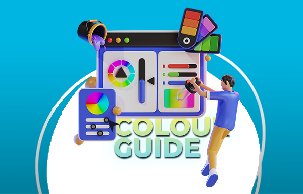
You’ve probably heard of the three main ways of indicating colour using computers and printing: CMYK, RGB, and Pantone colour. But, what difference does it make? Does it actually matter in your printing projects? Colour is colour… right?
Don’t get me wrong, they have similarities and you can convert files between them. But, there are key differences that make it hard to understand which colour type you should use.
At AAC, we are passionate about branding. We have been in the business for over 25 years, and we have mastered the craft of producing high-quality branding that meet our customers’ expectations. When it comes to branding, colour is right up there with the most important elements to consider. But making sure colour is accurate, vibrant and memorable is more than just a technical task—it’s a creative and strategic endeavour that requires skill, knowledge, and attention to detail.
One of the most important aspects of printing is the choice of colour mode. Colour mode refers to the way colours are represented and reproduced in different media, such as screens and papers. There are three main colour modes: CMYK, RGB, and Pantone. CMYK stands for Cyan, Magenta, Yellow, and Black, and it is used for printing. RGB stands for Red, Green, and Blue, and it is used for screens. Pantone is a company that uses the CMYK model to create a spot colour system, which is used for branding and special effects.
In this blog post, we will unveil the magic of CMYK and explain why it is the best colour mode for printing of all of our products. Anything physically printed needs to be printed in CMYK, so you can be sure of quality and accurate printing. For, some physical products however, Pantone may be the way to go. We will also give you some tips and tricks on how to set up your files in CMYK and avoid common pitfalls. Whether you are a designer, a business owner, or a sign enthusiast, this blog post will help you appreciate the beauty and complexity of sign printing.
The choice between CMYK, RGB, and Pantone is more than a technicality—it’s a strategic decision that shapes the final output. At AAC, we prioritise precision, and that begins with understanding the significance of each colour mode for delivering high-quality prints that mirror our customers’ expectations.
In this blog post, we will unveil the magic of CMYK, RGB, and Pantone and explain why and when to use each colour mode for your projects. Whether you are a designer, a business owner, or a sign enthusiast, this blog post will help you appreciate the beauty and complexity of colour printing.
CMYK, RGB, and Pantone, though all integral to the visual landscape, exhibit distinctive colour gamuts. A colour gamut is the range of colours that a colour mode can display or print. CMYK, RGB, and Pantone have different colour gamuts because they use different methods to create colours.
RGB uses additive colour mixing, which means that it combines different amounts of red, green, and blue light to create colours. The colourspace of RGB can produce a wide range of bright and saturated colours, especially on screens that emit light. RGB is ideal for digital media, such as websites, apps, videos, and games.
CMYK uses subtractive colour mixing, which means that it subtracts different amounts of cyan, magenta, yellow, and black ink from white paper to create colours. Printing CMYK can produce a narrower range of colours than RGB, but it can achieve more realistic and consistent colours on paper. The CMYK Printing is ideal for print media, such as signs, flyers, brochures, and magazines.
Pantone is technically a company. But they use their own propriety spot colour system, which means that it creates colours by mixing specific amounts of pre-formulated inks. Pantone can produce colours that are not achievable by CMYK, such as metallic, fluorescent, and pastel colours. They are ideal for branding and special effects, such as logos, packaging, and labels.
The difference between CMYK, RGB, and Pantone colour gamuts can cause some challenges when converting from one colour mode to another. While RGB may dazzle on screens with its vibrant spectrum, the transition to CMYK or Pantone can lead to dramatic changes. Colours may lose their vibrancy or accuracy during this conversion, significantly impacting the final print.
For example, imagine that you want to print a sign with a bright green layer to it. On your screen, you choose a green colour that looks like this:

However, when you print it using CMYK, the colour may look duller and darker, like this:
This is because CMYK cannot reproduce the same brightness and saturation as RGB. To get a closer match, you may need to adjust the CMYK values or use a Pantone colour instead.
Pantone offers a more precise and consistent colour matching system than CMYK. For instance, if you want to print a sign with the same green colour as the Starbucks logo, you can use the Pantone colour PMS 3425 C, which looks like this:

This way, you can ensure that the colour will be the same every time you print it, regardless of the printer or paper. Pantone colours are also more resistant to fading and environmental factors than CMYK colours.
However, Pantone colours also have some drawbacks. They are more expensive and time-consuming to print than CMYK colours, as they require a separate printing plate and ink for each colour. They are also not compatible with digital media, as they cannot be displayed accurately on screens. Therefore, you may need to convert your Pantone colours to RGB or CMYK for online or print purposes, which may result in some colour variation.
Now that you know the difference between CMYK, RGB, and Pantone, you might be wondering how to choose the right colour mode for your project. The answer depends on several factors, such as the purpose, the audience, the budget, and the medium of your project.
Here are some general guidelines to help you make the best decision:
Of course, these are not hard and fast rules, and you can always mix and match different colour modes for different parts of your project.
You can use RGB for the main design of your website, but use Pantone for your logo and icons. Or, you can use CMYK for the main content of your brochure, but use Pantone for the cover and the headings. The key is to understand the advantages and limitations of each colour mode, and to use them wisely and creatively.
However, when it comes to branding, unless you’re primarily a digital company, traditional advice would dictate that:
Especially when it comes to print marketing. This is for three main reasons:
Setting up print-ready artwork files in CMYK Printing involves strategic steps, particularly when using design programs like InDesign, Photoshop, Illustrator, or Publisher. These programs are commonly used by designers and artists to create and edit digital designs. However, they are not always configured to work in CMYK by default, and they may require some adjustments and settings to ensure optimal print quality.
Our blog provides practical tips and step-by-step instructions on how to configure CMYK files in these programs. Whether you are a seasoned designer or navigating this for the first time, mastering this process ensures your designs are print-ready and maintain their intended vibrancy.
Here are some general guidelines on how to set up your design in a CMYK colourspace:
However, if you use the RGB colour mode for a file that will be printed, the colours may look different or duller than what you see on your screen. This is because RGB has a wider range of colours than CMYK, and some RGB colours cannot be reproduced by CMYK inks.
To avoid this problem, you should convert your colour mode to CMYK before sending your file to print. Depending on the software program you use, there are different ways to do this. Here are some examples:
In Indesign, you can click Window> Colour > Dropdown button in the top right corner > CMYK.

In Photoshop, you can click Image > Mode > CMYK Color.
It’s easy in Illustrator, you can click File > Document Color Mode > CMYK Color.


In Publisher, you can click File > Info > Commercial Print Settings > Choose Color Model > Process Colors (CMYK).
By converting your colour mode to CMYK, you can ensure that your file is ready for printing and that the colours will look consistent and professional.
Make sure you’re checking it looks accurate to your brand colours and true to the vision for your design.
If you are using other software to export your file, you can check the software’s documentation or settings to see if it supports CMYK export. You can also check the file properties or details to see if it lists the color mode as CMYK or RGB.
By following these guidelines, you can ensure that your exported files are in CMYK and maintain their intended vibrancy. If you have any questions or concerns about exporting files in CMYK, please contact us. We are always happy to help you.
If you want to design your own print and signage, you can use AAC’s product design tool, which is a user-friendly and powerful online tool that allows you to create and customise your own products. You can choose from a wide range of products, such as wristbands, lanyards, badges, cards, or stickers. You can also choose from different materials, colours, sizes, and designs to suit your needs and preferences.
One of the best features of AAC’s product design tool is that it supports both CMYK printing and RGB colour modes. You can switch between the two colour modes, and see how your colours look on screen and on paper. You can also adjust your colours to achieve the best results. AAC’s product design tool will help you ensure that your colours are consistent and accurate across different media.
Colour is a powerful and essential element of design, as it can convey emotions, messages, and identities. However, colour can also be tricky and complex, as it can vary depending on the medium and the method of creation. Therefore, it is important to understand the difference between CMYK, RGB, and Pantone, and how to use them correctly for your projects.
CMYK Printing, RGB, and Pantone are three main colour modes that are used for different purposes and applications. CMYK printing is the best way to print on paper or canvas, RGB is used for screens, and Pantone is used for branding and special effects. Each colour mode has its own colour gamut, which is the range of colours that it can display or print. The colour gamuts of CMYK, RGB, and Pantone are different, which means that some colours cannot be reproduced or converted accurately from one mode to another.
If you want to learn, unnecessarily nuanced but interesting things about colour science and colour production… Click the link below to read our blog on just that!
To choose the right colour mode for your project, you need to consider the type and purpose of your project, as well as the quality and cost of the output. Generally, you should use RGB for digital media, CMYK for print media, and Pantone for high-end branding or special effects. However, you may also need to use a combination of colour modes for different aspects of your project, which may require some colour conversion and adjustment.
To minimize the colour variation and ensure the best results, you can use some tools and techniques, such as colour conversion charts, colour management systems, colour calibration tools, and colour proofing tools. By using these tools and techniques, you can create and maintain consistent and accurate colours for your projects.
We hope this blog post has helped you understand the difference between CMYK, RGB, and Pantone, and how to use them in your projects. If you have any questions or comments, please feel free to contact us. We would love to hear from you and help you with your colour needs. Thank you for reading and happy designing!
Storytelling is a powerful tool in event marketing. It creates an emotional connection between a company, its products, and its customers. Effective storytelling increases engagement
Schoolies/Leavers is a time to celebrate the end of your schooling journey with your friends and have some fun. But it can also be a