How to Tackle Your First Print Marketing Campaign with AAC

Print marketing is a form of marketing that involves sending customised and relevant messages to individual customers or prospects via mail, or in the form of printed signage in a locale, or other channels. It’s the oldest and most established form of marketing and any marketer worth their salt will tell you the benefits.

But how can you tackle your first personalised print marketing campaign and achieve your marketing goals? One of the easiest and most effective ways is to use AAC’s personalised print products, combined with this guide, which can help you plan, execute, and measure your campaign from start to finish.

Here are the steps you need to follow to create a successful print campaign with AAC:

Step 1: Define Your Goals and Objectives

The first step in any marketing campaign is to define your goals and objectives. What do you want to achieve with your print campaign? Who do you want to reach? How do you want to measure your success? These are some of the questions you need to answer before you start designing your print marketing materials.

Some common goals and objectives for print marketing campaigns are:

  • To increase brand awareness and recognition among your target audience
  • To generate leads and sales for your products or services
  • To build customer loyalty and retention
  • To launch a new product or service or promote a special offer
  • To educate your customers or prospects about your brand or industry

Once you have defined your goals and objectives, you need to make them SMART: Specific, Measurable, Achievable, Relevant, and Time-bound. This means that you need to set clear and realistic targets, indicators, and deadlines for your print campaign. For example, instead of saying “I want to increase sales”, you can say “I want to increase sales by 10% in the next three months by sending 5000 flyers to my existing customers and 5000 brochures to my prospects.”

Step 2: Set Your Budget

The next step in your print marketing campaign is to set your budget. How much can you afford to spend on your print materials, distribution, and evaluation? Your budget will depend on your goals and objectives, your target audience, your print marketing strategy, and your available resources.

Some of the factors that can affect your print marketing budget are:

  • The type and quality of your print marketing materials. For example, flyers and pamphlets are cheaper than vinyl stickers and bottle labels, and standard sizes and papers are cheaper than custom sizes and papers.
  • The quantity and frequency of your print marketing materials. For example, the more print materials you order and the more often you send them, the higher your costs will be.
  • The design and copy of your print marketing materials. For example, if you need to hire a professional designer or copywriter to create your print materials, you will have to pay for their services. (Or you could use AAC’s graphic designers to build your brand for you)
  • The distribution and delivery of your print materials. For example, if you need to mail your print materials to your customers or prospects, you will have to pay for postage and packaging.
  • The evaluation and analysis of your print campaign. For example, if you need to use tools or software to track and measure your print campaign, you will have to pay for their subscription or license.

To set your budget, you need to estimate the costs of each of these factors and compare them with your expected return on investment (ROI). You can use tools like AAC’s online calculator to get an instant quote for your print marketing materials and adjust your budget accordingly.

Step 3: Define Your Target Audience

The third step in your print marketing campaign is to define your target audience. Who are the people you want to reach with your print materials? What are their demographics, psychographics, behaviors, and preferences? How can you segment them into different groups based on their needs, wants, and interests?

Defining your target audience is crucial for your print marketing campaign, as it will help you tailor your print marketing materials to their specific characteristics and expectations. You can use tools like AAC’s online design tool to create personalised print marketing materials that appeal to your target audience and increase your response rate.

Some of the ways you can define your target audience are:

  • Use your existing customer data and feedback to identify your most profitable and loyal customers and their common traits and behaviors.
  • Use market research and customer insights to identify your potential customers and their needs, wants, and pain points.
  • Use competitor analysis and industry trends to identify your niche and your unique value proposition.
  • Use segmentation and persona creation to divide your target audience into smaller and more homogeneous groups based on their demographics, psychographics, behaviors, and preferences.

Step 4: Develop Your Message and Offer

The fourth step in your print marketing campaign is to develop your message and offer. What do you want to say to your target audience? What do you want them to do after they receive your print marketing materials? How can you persuade them to take action?

Your message and offer are the core of your print campaign, as they will determine the effectiveness and success of your print marketing materials. You need to craft a clear, concise, and compelling message and offer that communicate your brand identity, value proposition, and call to action.

Some of the tips to develop your message and offer are:

  • Use the AIDA model to structure your message and offer. AIDA stands for Attention, Interest, Desire, and Action, and it is a proven formula to create persuasive print marketing materials. You need to grab your target audience’s attention with a catchy headline, spark their interest with a relevant benefit, arouse their desire with an irresistible offer, and prompt their action with a clear and urgent call to action.
  • Use the 4 Ps of marketing to define your offer. The 4 Ps of marketing are Product, Price, Place, and Promotion, and they are the essential elements of your marketing mix. You need to describe your product or service and its features and benefits, set your price and its value and discounts, choose your place and its location and accessibility, and highlight your promotion and its exclusivity and urgency.

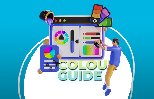
Compelling Copywriting

Use the 4 Cs of copywriting to write your message and offer. The 4 Cs of copywriting are Clear, Concise, Compelling, and Credible, and they are the key qualities of effective copywriting. You need to write your message and offer in a clear and simple language that your target audience can understand, use concise and short sentences and paragraphs that your target audience can read, use compelling and emotional words and phrases that your target audience can relate, and use credible and factual statements and testimonials that your target audience can trust.

Step 5: Design Your Print Marketing Materials

The fifth step in your print marketing campaign is to design your print materials. How do you want your print marketing materials to look like? What are the best formats, sizes, papers, and finishes for your print marketing materials? How can you make your print marketing materials stand out and attract attention?

Designing your print marketing materials is an important step in your print marketing campaign, as it will affect the visual appeal and impact of your print materials. You need to create a consistent and attractive design that reflects your brand identity, message, and offer.

Some of the tips to design your print marketing materials are:

  • Use AAC’s online design tool to create your print marketing materials. AAC’s online design tool is a user-friendly and powerful tool that allows you to create stunning print materials in minutes. You can choose from a variety of formats, sizes, papers, and finishes to suit your brand and message, and customize them with your own images, colors, fonts, and text, to make them unique and distinctive. You can also use AAC’s online design tool to preview and proofread your print materials before you order them.

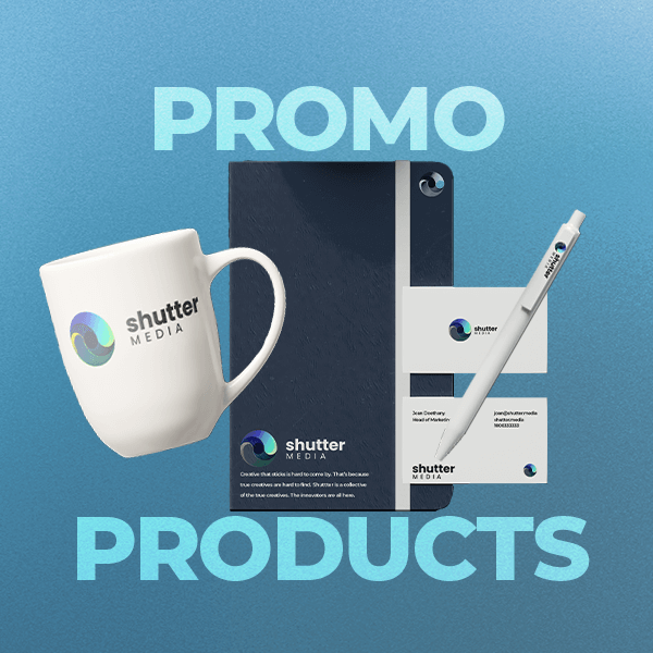
Design On Tonnes Of Print Products

If you’re not an expert, reach out. We have a team of graphic designers ready to help you with your campaigns. And we have an extensive of range of print marketing and promo products.

Our flyers and pamphlets are sleek modern and we can help you design them. They are the core of your print marketing campaign.
Print Marketing Products
Printed Signage Products
Printed Promotional Products

Step 6: Execute Your Print Marketing Campaign

The sixth step in your print marketing campaign is to execute your print marketing campaign. How do you want to distribute and deliver your print marketing materials? When do you want to send your print marketing materials? How do you want to integrate your print marketing campaign with your other marketing channels?

Executing your print marketing campaign is a crucial step in your print marketing campaign, as it will determine the reach and exposure of your print marketing materials. You need to plan and implement a distribution and delivery strategy that maximizes your print marketing campaign’s potential and performance.

Some of the tips to execute your print marketing campaign are:

  • Order your print marketing materials from AAC. AAC is a leading provider of personalised direct print products, with over 20 years of experience and expertise. AAC can help you design, print, and deliver your print materials with quality, speed, and affordability. You can order your print materials online or by phone, and get a fast and free delivery to your address. You can also track your order status and get a confirmation email when your order is shipped.
  • Choose the best distribution and delivery method for your print materials. There are different ways to distribute and deliver your print materials, depending on your goals, objectives, budget, and target audience. Some of the common distribution and delivery methods

Consider How You’re Branding

Branding is not just an option; it’s a necessity in today’s marketplace. When we see 10,000 ads a day, you need to brand more and better. But how do you brand more and better? How do you make sure your brand stands out from the crowd and resonates with your target audience?

That’s where AAC comes in. We are your one-stop shop for all your branding needs. Whether you need custom printed products, signage, apparel, or promotional items, we have you covered. We can help you create a consistent and memorable brand identity across all your marketing channels.

We also offer expert advice and guidance on how to brand effectively. Our team will help you define your brand attributes, personality, and voice. We can help you craft a compelling brand story and slogan. We can help you measure and improve your brand awareness and image. AAC is more than just a printing company. We are your branding partner.

At AAC, we believe that branding is not a one-time thing. It’s an ongoing process that requires constant attention and improvement. That’s why we offer a range of services and products to help you keep your brand fresh and relevant. We can help you update your branding materials with new designs, colors, and messages. Our team will assist you launching new campaigns and promotions to attract and retain customers. We can help you expand your brand reach and exposure with new products and platforms.

At AAC, we are passionate about branding. We love helping our clients create and grow their brands. We love seeing the results of our work and the impact it has on their businesses.

AAC are not just a supplier. We’re here to help you brand all of your ventures.

CMYK, Pantone or RGB Colour… What’s the Difference In Printing?

You’ve probably heard of the three main ways of indicating colour using computers and printing: CMYK, RGB, and Pantone colour. But, what difference does it make? Does it actually matter in your printing projects? Colour is colour… right?

Wrong! They’re Very Different

Don’t get me wrong, they have similarities and you can convert files between them. But, there are key differences that make it hard to understand which colour type you should use.

At AAC, we are passionate about branding. We have been in the business for over 25 years, and we have mastered the craft of producing high-quality branding that meet our customers’ expectations. When it comes to branding, colour is right up there with the most important elements to consider. But making sure colour is accurate, vibrant and memorable is more than just a technical task—it’s a creative and strategic endeavour that requires skill, knowledge, and attention to detail.

One of the most important aspects of printing is the choice of colour mode. Colour mode refers to the way colours are represented and reproduced in different media, such as screens and papers. There are three main colour modes: CMYK, RGB, and Pantone. CMYK stands for Cyan, Magenta, Yellow, and Black, and it is used for printing. RGB stands for Red, Green, and Blue, and it is used for screens. Pantone is a company that uses the CMYK model to create a spot colour system, which is used for branding and special effects.

Let’s Understand CMYK Printing

In this blog post, we will unveil the magic of CMYK and explain why it is the best colour mode for printing of all of our products. Anything physically printed needs to be printed in CMYK, so you can be sure of quality and accurate printing. For, some physical products however, Pantone may be the way to go. We will also give you some tips and tricks on how to set up your files in CMYK and avoid common pitfalls. Whether you are a designer, a business owner, or a sign enthusiast, this blog post will help you appreciate the beauty and complexity of sign printing.

The choice between CMYK, RGB, and Pantone is more than a technicality—it’s a strategic decision that shapes the final output. At AAC, we prioritise precision, and that begins with understanding the significance of each colour mode for delivering high-quality prints that mirror our customers’ expectations.

In this blog post, we will unveil the magic of CMYK, RGB, and Pantone and explain why and when to use each colour mode for your projects. Whether you are a designer, a business owner, or a sign enthusiast, this blog post will help you appreciate the beauty and complexity of colour printing.

The Difference Between CMYK Printing, RGB, and Pantone

CMYK, RGB, and Pantone, though all integral to the visual landscape, exhibit distinctive colour gamuts. A colour gamut is the range of colours that a colour mode can display or print. CMYK, RGB, and Pantone have different colour gamuts because they use different methods to create colours.

RGB:

RGB uses additive colour mixing, which means that it combines different amounts of red, green, and blue light to create colours. The colourspace of RGB can produce a wide range of bright and saturated colours, especially on screens that emit light. RGB is ideal for digital media, such as websites, apps, videos, and games.

CMYK:

CMYK uses subtractive colour mixing, which means that it subtracts different amounts of cyan, magenta, yellow, and black ink from white paper to create colours. Printing CMYK can produce a narrower range of colours than RGB, but it can achieve more realistic and consistent colours on paper. The CMYK Printing is ideal for print media, such as signs, flyers, brochures, and magazines.

Pantone:

Pantone is technically a company. But they use their own propriety spot colour system, which means that it creates colours by mixing specific amounts of pre-formulated inks. Pantone can produce colours that are not achievable by CMYK, such as metallic, fluorescent, and pastel colours. They are ideal for branding and special effects, such as logos, packaging, and labels.

The difference between CMYK, RGB, and Pantone colour gamuts can cause some challenges when converting from one colour mode to another. While RGB may dazzle on screens with its vibrant spectrum, the transition to CMYK or Pantone can lead to dramatic changes. Colours may lose their vibrancy or accuracy during this conversion, significantly impacting the final print.

Understanding Conversions

For example, imagine that you want to print a sign with a bright green layer to it. On your screen, you choose a green colour that looks like this:

CMYK Printing Colours From An RGB Conversion

However, when you print it using CMYK, the colour may look duller and darker, like this:

This is because CMYK cannot reproduce the same brightness and saturation as RGB. To get a closer match, you may need to adjust the CMYK values or use a Pantone colour instead.

Pantone offers a more precise and consistent colour matching system than CMYK. For instance, if you want to print a sign with the same green colour as the Starbucks logo, you can use the Pantone colour PMS 3425 C, which looks like this:

This way, you can ensure that the colour will be the same every time you print it, regardless of the printer or paper. Pantone colours are also more resistant to fading and environmental factors than CMYK colours.

However, Pantone colours also have some drawbacks. They are more expensive and time-consuming to print than CMYK colours, as they require a separate printing plate and ink for each colour. They are also not compatible with digital media, as they cannot be displayed accurately on screens. Therefore, you may need to convert your Pantone colours to RGB or CMYK for online or print purposes, which may result in some colour variation.

How to Choose the Right Colour Mode for Your Project

Now that you know the difference between CMYK, RGB, and Pantone, you might be wondering how to choose the right colour mode for your project. The answer depends on several factors, such as the purpose, the audience, the budget, and the medium of your project.

It Depends On Application:

Here are some general guidelines to help you make the best decision:

  • If your project is for digital use, such as a website, an app, a video, or a game, you should use RGB. RGB will give you the most flexibility and variety of colours on screens, and it will also match the colour mode of most digital devices and platforms. RGB is also the easiest colour mode to work with, as you can easily adjust the hue, saturation, and brightness of colours using tools like Photoshop or Illustrator.
  • When your project is for print use, such as a sign, a flyer, a brochure, or a magazine, you should use CMYK. CMYK will give you the most realistic and consistent colours on paper, and it will also match the colour mode of most printers and printing services. CMYK is also the most economical colour mode to use, as you can save on ink costs by using less colours or by using different shades of the same colour.
  • If your project is for branding or special effects, such as a logo, a packaging, or a label, you should use Pantone. Pantone will give you the most unique and distinctive colours that are not possible with CMYK, and it will also ensure the colour accuracy and consistency across different media and materials. Pantone is generally the most professional and corporate colour mode to use, as it will show your attention to detail and your commitment to quality.

Of course, these are not hard and fast rules, and you can always mix and match different colour modes for different parts of your project.

For Example:

You can use RGB for the main design of your website, but use Pantone for your logo and icons. Or, you can use CMYK for the main content of your brochure, but use Pantone for the cover and the headings. The key is to understand the advantages and limitations of each colour mode, and to use them wisely and creatively.

However, when it comes to branding, unless you’re primarily a digital company, traditional advice would dictate that:

CMYK is the best for the most applications

Especially when it comes to print marketing. This is for three main reasons:

  1. It’s not as expensive and time-consuming as Pantone colours.
  2. It’s the most compatible with old and new printers.
  3. The conversion from CMYK to RGB is more generally more accurate than doing the reverse. This is because RGB covers a colour spectrum wider than CMYK. This results in many RGB colours being unsuitable for converting to a CMYK counterpart. Basically, all CMYK colours have a similar looking RGB colour, but it doesn’t always work in the reverse.

How to Set Up CMYK Printing Files

Setting up print-ready artwork files in CMYK Printing involves strategic steps, particularly when using design programs like InDesign, Photoshop, Illustrator, or Publisher. These programs are commonly used by designers and artists to create and edit digital designs. However, they are not always configured to work in CMYK by default, and they may require some adjustments and settings to ensure optimal print quality.

Our blog provides practical tips and step-by-step instructions on how to configure CMYK files in these programs. Whether you are a seasoned designer or navigating this for the first time, mastering this process ensures your designs are print-ready and maintain their intended vibrancy.

Here are some general guidelines on how to set up your design in a CMYK colourspace:

However, if you use the RGB colour mode for a file that will be printed, the colours may look different or duller than what you see on your screen. This is because RGB has a wider range of colours than CMYK, and some RGB colours cannot be reproduced by CMYK inks.

To avoid this problem, you should convert your colour mode to CMYK before sending your file to print. Depending on the software program you use, there are different ways to do this. Here are some examples:

In Indesign, you can click Window> Colour > Dropdown button in the top right corner > CMYK.

CMYK Printing Conversion In Photoshop

In Photoshop, you can click Image > Mode > CMYK Color.

It’s easy in Illustrator, you can click File > Document Color Mode > CMYK Color.

Converting for CMYK Printing in Illustrator
Converting to CMYK Printing settings in Publisher.

In Publisher, you can click File > Info > Commercial Print Settings > Choose Color Model > Process Colors (CMYK).

By converting your colour mode to CMYK, you can ensure that your file is ready for printing and that the colours will look consistent and professional.

Everytime you convert a colour…

Make sure you’re checking it looks accurate to your brand colours and true to the vision for your design.

If you are using other software to export your file, you can check the software’s documentation or settings to see if it supports CMYK export. You can also check the file properties or details to see if it lists the color mode as CMYK or RGB.

By following these guidelines, you can ensure that your exported files are in CMYK and maintain their intended vibrancy. If you have any questions or concerns about exporting files in CMYK, please contact us. We are always happy to help you.

How to design your own print and signage using AAC’s product design tool?

If you want to design your own print and signage, you can use AAC’s product design tool, which is a user-friendly and powerful online tool that allows you to create and customise your own products. You can choose from a wide range of products, such as wristbands, lanyards, badges, cards, or stickers. You can also choose from different materials, colours, sizes, and designs to suit your needs and preferences.

One of the best features of AAC’s product design tool is that it supports both CMYK printing and RGB colour modes. You can switch between the two colour modes, and see how your colours look on screen and on paper. You can also adjust your colours to achieve the best results. AAC’s product design tool will help you ensure that your colours are consistent and accurate across different media.

Using AAC’s Product Design Tool to create your own customised collateral is easy:

  1. Go to AAC’s website: First, go to AAC’s website and navigate to the Product Design Tool page. You can find the link to the page on the main menu or the homepage.
  2. Choose your product: Once you are on the Product Design Tool page, choose the product you want to customise. In this case, select “Roll Tickets,” for example.
  3. Select your template: After choosing your product, select the template you want to use. AAC offers a variety of templates for roll tickets, such as “Admit One”, “Bar”, “Beer & Wine”, or “$1, $2 & $5”. You can choose the one that best suits your needs and preferences, or start from scratch using a base colour.
  4. Customise your design: Once you have selected your template or base colour, you can start customising your design. You can add your own text, images, logos, and other elements to the template, and adjust the colours, fonts, and sizes to your liking. You can also use AAC’s built-in clipart library to add more design elements to your roll tickets. Or any other product, obviously.
  5. Preview your design: After customising your design, you can preview it in real-time to see how it will look when printed. You can zoom in or out, rotate, or move your design, and see the changes instantly. You can also save your design and come back to it later, or share it with your team or friends.
  6. Order your roll tickets: Once you are satisfied with your design, you can order your roll tickets from AAC. You can choose the quantity, size, and other options that suit your needs, and get them delivered to your doorstep in no time.

Understanding Colour…

Colour is a powerful and essential element of design, as it can convey emotions, messages, and identities. However, colour can also be tricky and complex, as it can vary depending on the medium and the method of creation. Therefore, it is important to understand the difference between CMYK, RGB, and Pantone, and how to use them correctly for your projects.

CMYK Printing, RGB, and Pantone are three main colour modes that are used for different purposes and applications. CMYK printing is the best way to print on paper or canvas, RGB is used for screens, and Pantone is used for branding and special effects. Each colour mode has its own colour gamut, which is the range of colours that it can display or print. The colour gamuts of CMYK, RGB, and Pantone are different, which means that some colours cannot be reproduced or converted accurately from one mode to another.

If you want to learn, unnecessarily nuanced but interesting things about colour science and colour production… Click the link below to read our blog on just that!

To Conclude:

To choose the right colour mode for your project, you need to consider the type and purpose of your project, as well as the quality and cost of the output. Generally, you should use RGB for digital media, CMYK for print media, and Pantone for high-end branding or special effects. However, you may also need to use a combination of colour modes for different aspects of your project, which may require some colour conversion and adjustment.

To minimize the colour variation and ensure the best results, you can use some tools and techniques, such as colour conversion charts, colour management systems, colour calibration tools, and colour proofing tools. By using these tools and techniques, you can create and maintain consistent and accurate colours for your projects.

We hope this blog post has helped you understand the difference between CMYK, RGB, and Pantone, and how to use them in your projects. If you have any questions or comments, please feel free to contact us. We would love to hear from you and help you with your colour needs. Thank you for reading and happy designing!