The Technicals Of Colour Science: Colour Extension Class

Chances are if you’re reading this blog, you came from our blog comparing RGB, Pantone and CMYK, and how it applies to your print project with AAC. In that blog, we covered the basics! But, if you are a graphic designer, marketing agency, or a colour enthusiast, you might be interested in learning more about the technicals behind the ‘colourimetric chain,’ the RGB and CMYK modes, and the multichromy and extended gamut Pantone technologies. Colour science is much more nuanced than people think. It’s a science, after all! But, just know that the colour science we talk about in this blog is…

Stuff You Don’t Need To Know For Your Project

If you’re looking to fulfill an order with AAC and trying to understand how to send us your design proof, you’d be far better off reading our blog, CMYK Printing, RGB & Pantone.. What’s The Difference..?

Consider this our extension class. Chances are you don’t need to know this information for your brand. But for those who are interested, we’re going to go above and beyond explaining all the technical sides to everything we do with your brand. Colour science is surprisingly convoluted and technical.

PSA: Basic Understanding

In our ‘Colour Basics’ blog post, you will learn about the difference between CMYK, RGB, and Pantone colour modes, and how to use them effectively for your branding needs. You will discover the advantages and limitations of each colour mode, and how to choose the right one for your design project. You will also explore some alternative solutions, such as multi-colour and extended gamut printing, that can expand the range of colour reproduction and enhance the quality and consistency of your branding materials.

How to Choose the Right Colour Mode for Your Project:

This part explains the difference between CMYK, RGB, and Pantone colour modes, and gives some general guidelines on how to choose the best one for your project based on the purpose, the audience, the budget, and the medium of your project. It also gives some examples of how to mix and match different colour science and modes for different effects.


& We Help You Understand How to Set Up CMYK Printing Files:

This part provides practical tips and step-by-step instructions on how to configure CMYK files in various design programs, such as InDesign, Photoshop, Illustrator, or Publisher. It also warns about the potential colour discrepancies that may occur when converting RGB files to CMYK for printing.

But if you’ve already read that blog, or you know about the basics of colour science already…

Let’s Get Technical!

RGB, CMYK and other Gamuts

First, let’s talk about the RGB and CMYK modes. RGB stands for red-green-blue and is used for screens. The colour is bright and luminous. CMYK stands for cyan-magenta-yellow-key and is used for print. The colour is less bright.

To visualize the differences between these colourimetric modes, we can look at the gamut, which is the range of colours that a colourimetric mode can reproduce. The diagram below shows the various gamuts, according to the various colourimetric modes.

The largest gamut corresponds to what a human eye (LAB) can see, and we note that the RGB offers a spectrum much broader than the CMYK.

In itself, the RGB or the CMYK do not have a particular gamut, they are just systems of coding of the colours. These are called colour spaces. A colour space is a way of representing the range of colours that a device can display or print. The colour space (Adobe RGB 98, sRGB, FOGRA39…) will determine how their gamut will change between each colour space. It’s easier to understand in an example. For example, an RGB image in Adobe RGB 98 will offer a very broad spectrum of colours, but will require a screen compatible with this colourimetric mode. On the contrary, the CMYK gamut of FOGRA 39 will be very restricted, but will guarantee a faithful offset printing. We can also note the colourimetric space of the Pantone range, which approaches Adobe RGB 98.

As print specialists, we just want to help you get the most out of your marketing collateral projects, define colours and try to deploy them as well as possible on all the expressions of the brand. These expressions are articulated around three main branches:

  • Digital (website, social networks, video…)
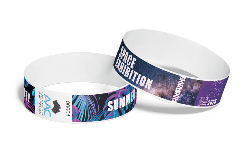
  • Print (brochure, posters, banners, signage, wristbands…)
  • Products (physical goods sold to consumers)

The Technicals

Pantone, CMYK, and RGB are different colour systems that are used for different purposes in design and printing. Pantone is a spot colour system that uses pre-mixed ink colours that are assigned numbers and names. Each Pantone colour is consistent and identical across different printers and products. Pantone colours can also have special effects such as metallic, fluorescent, or pastel. Pantone is ideal for branding, logos, and packaging that require precise colour matching and consistency. However, Pantone can be more expensive and limited than CMYK or RGB, as it requires separate printing plates and inks for each colour.

The History: Pantone

The history of Pantone dates back to the 1950s, when it was founded by Lawrence Herbert, a chemistry graduate who worked for a commercial printing company in New Jersey. He developed a system to standardize and simplify the colour production process, using a set of numbered swatches that could be easily matched and reproduced. He later bought the company, M & J Levine Advertising, and renamed it Pantone.

In 1963, he launched the first Pantone Matching System (PMS), which consisted of 10 colours. Over the years, he expanded the system to include more colours and categories, such as pastels, metallics, and fluorescents. He also collaborated with various industries and organizations, such as fashion, interior design, and NASA, to create custom colour palettes and solutions. Today, Pantone is recognized as a global authority on colour, with over 10,000 colours in its system and a range of products and services for colour management and communication.

CMYK: Broad Strokes

CMYK is a process printing system that uses four ink colours: Cyan, Magenta, Yellow, and Black. By mixing these four colours, all other colours can be created in print. CMYK is also known as four-coluor process or process colour, named as such because four printing plates are used in the printing process. CMYK is an additive process, meaning printing CMYK adds each layer of colour via a halftone technique which results in full-colour prints. This colourspace is commonly used for printing magazines, books, flyers, posters, and other materials that have a lot of colours and images. However, CMYK cannot produce colours of the same vibrancy or accuracy as Pantone or RGB, and it can vary depending on the printer, paper, and ink quality.

Origins of CMYK

The history of CMYK goes back to the 19th century, when several inventors and scientists experimented with different methods of colour printing. One of the pioneers was Jacob Christoph Le Blon, a French painter and engraver who developed a four-colour printing process using red, yellow, blue, and black inks in 1710. He applied his technique to print reproductions of paintings and portraits, but he faced financial difficulties and legal disputes that hindered his work. In 1906, the American Printing Ink Company introduced the first standardized set of CMYK inks, based on the colour theory of Wilhelm Ostwald, a German chemist and Nobel laureate. In 1931, the International Commission on Illumination (CIE) established a universal colour space that defined the relationship between colours and light. This paved the way for the development of more accurate and consistent colour reproduction systems, such as the FOGRA39 standard that is widely used today.

The Newest of the Three: RGB Standard

RGB is the colour system used for digital or screen-based artwork and imagery, and it stands for Red, Green, and Blue. These colours are the primary colours of light, and by adding different amounts of light to each colour, all other colours can be created on a screen. RGB is also known as additive colour, as adding more light results in brighter and lighter colours. RGB is suitable for web design, digital art, video, and photography that are displayed on monitors, TVs, smartphones, and other devices. However, RGB cannot be printed directly, as it has a wider colour gamut than CMYK or Pantone, and it needs to be converted to CMYK or Pantone for printing purposes .

The History: RGB

The history of RGB technically dates back to the 17th century, when Isaac Newton discovered that white light could be split into a spectrum of colours by passing it through a prism. He also found that the colours could be recombined into white light by using another prism. Newton named the colours of the spectrum as red, orange, yellow, green, blue, indigo, and violet, and arranged them in a circle to show the relationships between them. He also observed that some colours could be mixed to form other colours, such as red and blue to make purple.

But it wasn’t really until the 19th century, Thomas Young and Hermann von Helmholtz proposed the trichromatic theory of colour vision, which stated that the human eye has three types of receptors that are sensitive to red, green, and blue light. They also suggested that any colour could be produced by stimulating these receptors in different proportions. In the 20th century, various technologies and devices were developed to display and capture colours using RGB, such as cathode ray tubes, colour television, digital cameras, and computer monitors.

Just Understand that the Technicals Differ

The technicals of colour production vary depending on the colour system and the medium used.

For Pantone, the colour production involves mixing a specific formula of base inks to create a precise colour that matches the Pantone swatch. The ink is then applied to the printing surface using a separate plate for each colour. For CMYK, the colour production involves mixing varying amounts of cyan, magenta, yellow, and black inks to create a range of colours. The ink is then applied to the printing surface using four plates, one for each colour, in a halftone pattern of tiny dots. For RGB, the colour production involves mixing varying amounts of red, green, and blue light to create a range of colours. The light is then emitted from the screen using pixels, which are tiny dots that can change colour and brightness.

Where To Start When Building A Brand?

When we start creating for our brand our rebrand, we think it’s best to think about colour science in CMYK. Obviously there’s plenty of other things to think about when creating brand and you can read about them here. But when it comes to colour we think your brand should be built in CMYK first. Obviously we’re a little biased here, as most of the work we do, we start in CMYK, and our software is configured in CMYK for print. But, we don’t just say this for our own personal reasoning, here’s why we think…

CMYK is the first point of call when branding:

Creating in CMYK first is a smart choice for designers who want to ensure that their colours will be consistent and accurate across various print and promo products. CMYK is the most widely compatible standard with printers, even though it allows less colour range than RGB or Pantone.

More broadly, when being creative, it isn’t so much about ‘thinking outside the box.’ It’s much more about defining the limitations and working with them. You need to understand how to work within the box you find yourself and your brand in. There’s always limitations. Budgets, time, resources; you name it. In the world of colour science, CMYK is that limitation.

CMYK, is the least broad colourspace, objectively. It’s the most limiting. It produces significantly less total colours than that of RGB and Pantone. But, it’s also the most universal.

By starting in CMYK, designers can avoid the disappointment of finding out that their colours cannot be reproduced exactly in print, which may result in a duller or less vibrant appearance. Moreover, creating in CMYK first can save time and effort by not having to convert colours from RGB or Pantone to CMYK later, which may require some adjustments and fine-tuning. Therefore, creating in CMYK first is a practical and efficient way to optimize the colour potential for all media, especially print.

It is the most widely compatible standard with all the diversity of the vast majority of printers. It will guarantee the optimal correspondence of the colours between the various print and promo products. And it will be more likely to convert easily and accurately across to any RGB or Pantone colour where necessary.

So, When We Are Creating Our Brand:

So we have now entered the kitchen, and have begun developing the recipe that will result in the visual identity of our brand. During this phase, we iterate creatively, going back and forth with our client until the project is approved. Remember, CMYK is a necessity, and we cannot ignore it. These are colours that are compatible with the vast majority of print and physical products. It also most easily converts into pantone.

If we assume, for the sake of simplicity, that RGB (sRGB) ]offers the maximum colourimetric potential (100%) then, let’s say that the CMYK (FROGRA39) will offer only 80% of the potential. This figure of 80% does not result from any scientific calculation, it is just to give you an order of idea. We could start the workflow in RGB or Pantone to make sure that the colour has more options and is brighter and more vibrant.

But, if we do it that way, you will be disappointed when it comes to anything print. Because that extra 20% is not replicable. Meaning that if your colour falls within it, it will look completely different when it comes to using anything in print. Smart designers will make sure they choose colours that are replicable across all colourspaces…

It is thus advisable to start in CMYK to reserve the conversion in RGB or Pantone.

Make It Easier On Yourself

Print is totally unavoidable. So why not make sure that you can remain consistent across all of your brands media?

However, it is not as simple as that, and this chronology is not always easy to respect. Let’s take the example of a poster campaign, the file for printing will be set in CMYK and once the proof is signed by the client, this same document will be used as a “master” to be distributed on the web or on social networks. The conversion CMYK to RGB or sRGB is not magic. It’s often impossible to find perfect accuracy. In this example, the colourimetric potential is thus under-exploited in digital.

In a workflow split between CMYK and RGB or sRGB, the files are hardly interoperable between these two worlds. If we seek to optimize the colourimetric potential of each world, that will require some gymnastics, and many duplications of files.

But, if we limit ourselves to CMYK from the start, it allows for the easiest workflow between all colourspaces. Because RGB and Pantone have more options for colour, it’s far more likely your colour will convert easily.

But what about the gymnastics? What if your brand is already oriented around RGB? How do we manage colour when converting between the three main colourspaces?

The answer is: by using colour management tools and techniques.

Colour Management: Bridging The Colour Science Gap

Colour management is the process of ensuring that the colours you see on your screen are as close as possible to the colours you get on print. It involves several steps and components, let’s go through them and the terms you need to know:

Colour Profiles

These are files that describe the characteristics and capabilities of a colour device, such as a monitor, a printer, a scanner, etc. They are based on standards such as ICC (International Colour Consortium) or ISO (International Organization for Standardization). They help to translate the colours from one device to another, by using a common reference space (usually LAB or XYZ).

Colour Conversion

We’ve already touched on this a little bit, but the process of changing the colour values from one colour space to another, according to the colour profiles, is super nuanced. For example, when you convert an RGB image to CMYK, you are changing the colour values from the RGB colour space to the CMYK colour space, using the colour profiles of your monitor and your printer. This can be done by software (such as Photoshop, Illustrator, InDesign, etc.) or by hardware (such as RIPs, or raster image processors, that control the printing process). The key is, you ideally want to pick colours that have very similar colour representations across all three of the colourspaces. This means often foregoing picking more vibrant or neon type colours that won’t show up on the CMYK spectrum, but might be covered by the RGB space.

Colour Calibration

This is the process of adjusting the settings of a coluor device, such as a monitor or a printer, to make sure that it reproduces the colours accurately and consistently. This can be done by using a colourimeter, a device that measures the coluor output of a device and compares it to a reference standard. Then, the device settings are modified to match the reference standard as closely as possible. This can also be done by using a test chart, a printed sheet that contains a range of colours, and comparing it visually to a reference chart on the screen or on another print.

Colour Proofing

This is the process of checking the colour accuracy and quality of a print before the final production. This can be done by using a soft proof, a simulation of the print on the screen, or by using a hard proof, a physical print that mimics the final output. A soft proof requires a calibrated monitor and a colour profile of the printer, while a hard proof requires a calibrated printer and a colour profile of the paper. Both types of proof can be compared to the original design on the screen or on another print.

By using these tools and techniques, you can achieve a good colour consistency between digital and print, and avoid unpleasant surprises. However, there are some limitations and challenges that you should be aware of.

Limitations and Challenges

As we have seen, the RGB and CMYK modes have different gamuts, and not all colours can be reproduced by both modes. This means that some colours will be lost or altered during the conversion process. This is especially true for colours that are out of the CMYK gamut, such as bright greens, oranges, or purples. These colours will be replaced by the closest possible match in the CMYK gamut, which may result in a duller or darker appearance.

Colour Science, Differences between RGB and CMYK.

Here’s an exaggerated example, but this should illustrate to you how CMYK will look different. CMYK printing would appear similar to the guy on the left, and RGB would be more akin to the guy on the right. CMYK is generally a more muted and less vibrant colour space, however it won’t be this different for your project.

Spot the Differences:

You can see that some colours, such as the green and the orange, have changed significantly, and the overall image looks less vibrant and more muted.

So, how can we deal with this problem? There are a few possible solutions, such as:

There’s A Few Solutions To Your Brands Colour Science

  • Choosing colours that are within the CMYK gamut from the start, or adjusting them manually after the conversion. This can be done by using a gamut warning tool, which shows you which colours are out of the CMYK gamut, and by using a colour picker tool, which shows you the closest CMYK match for a given RGB colour. This way, you can avoid or minimize the colour loss and ensure a good colour fidelity.
  • Using spot colours, which are special inks that are mixed and applied separately from the CMYK inks. Spot colours can reproduce colours that are out of the CMYK gamut, such as metallic, fluorescent, or Pantone colours. Spot colours can also enhance the contrast and the saturation of the CMYK colours, by adding a layer of ink on top of them. However, spot colours have some drawbacks, such as increasing the cost and the complexity of the printing process, and requiring a separate colour profile and proofing system.
  • Using multichromy or extended gamut printing, which are advanced printing techniques that add more base inks to the CMYK ink set, such as orange, green, and violet. These additional inks expand the colour gamut of the print, and allow to reproduce more colours that are closer to the RGB gamut. For example, Pantone has developed an extended gamut guide, which shows how to simulate most of the Pantone spot colours by using seven-colour process printing. Multichromy and extended gamut printing have some advantages, such as reducing the need for spot colours, improving the colour quality and consistency, and simplifying the colour management and proofing process. However, they also have some challenges, such as requiring a specific printing equipment and software, and a higher level of expertise and control.

The Constraints of CMYK Printing

In reality, the constraint of CMYK is not as strong as in the past. Historically, the presses were all of type Offset. There was not too much choice and the files had to be obligatorily in CMYK (FOGRA39), and the printers were unable to print any file in RGB (ex: a Word doc or PNG file). Then arrived the digital presses and the large format printers. A digital press it is a little like a giant colour copier, you can give a file in RGB, it will convert it all alone in CMYK with the colourimetric profile specific to its machine.

All of this is practically standard practice today. It’s something we take for granted in the industry. However, that’s not to say there hasn’t been innovation in the world of colour.

Recent Innovations in Colour Science

These last few years, new modes of impression have evolved a tonne. A great place to start would be in Extended Gamut Pantone, which is almost it’s own colour science entirely.

‘Multi-Colour’ and Extended Gamut Pantone

Multi-colour technology is an innovative printing technique that extends the range of colour reproduction offered by the traditional CMYK (cyan, magenta, yellow and key) in four-colour process, this is accomplished by adding to the printing process three colours. In total we will have 7 inks, the traditional CMYK + Orange + Green + Violet, which are the result of the combination optimized for the Adobe RGB profile.

Pantone provides an “Extended Gamut” colour chart where one will find the whole of the colourimetric references in 7 colours. One thus obtains a very vast space of colour and one can affirm that the majority of the Pantone colours are in the space of colour of the Multichromy with differences so fine small that one will not perceive them with the human eye.

Today the large ink jet large format printers (for signage applications) or the digital presses have 6 or 7 cartridges of colours (ex: cyan, magenta, yellow, black, orange, purple and green) which enable them to print with a gamut which tends to approach the RGB (sRGB). Moreover the recent HP INDIGO digital presses are sold to print up to 97% of the Pantone colours. Another example, Konica claims to print 89% of the Pantone colours. Consequently, why give them CMYK in entry, whereas one can print true RGB pastries.

The majority of the numerical machines will thus convert the Pantone value indicated in the PDF into multichromic value by being based on the spectral information and by minimizing its visual difference when this one is printed. Following this logic, you can thus send in digital printing a document with pantones (instead of an RGB or CMYK colour). The machine will automatically treat the colour to obtain the rendering closest to the Pantone wanted.

In Conclusion:

Colour science is a complex and fascinating topic, and it plays a crucial role in the design and communication of a brand.

As a graphic designer, marketing agency, or colour science enthusiast, you should be aware of the technical aspects of colour, and how to manage them effectively. By using the RGB and CMYK modes, and the colour management tools and techniques, you can create and print stunning and consistent colours for your brand. However, you should also be aware of the limitations and challenges of these modes, and how to overcome them by using alternative solutions, such as spot colours, multichromy, or extended gamut printing. By doing so, you can take advantage of the full potential of colour, and make your brand stand out from the crowd.

But, Don’t Stress

We hope this blog has helped you to learn more about the technical side of colour science, and to improve your colour skills and knowledge. But, just know that you don’t need to be this technical. We are the experts, here to help for a reason. This stuff, is almost certainly, not necessary to know for your signage, ID or Print Marketing.

However, it can be fun to learn about something you never knew went any deeper. Hopefully, you learned how deep the colour science rabbit hole can go. This is why our expert graphic designers are here to help you.

If you need any help with your print project, don’t hesitate to contact us at AAC. We are experts in colour science, printing and branding, and we can help you achieve the best results for your brand.

Are you getting what you've paid for

Are You Getting What You’ve Paid For?

When purchasing wristbands, you would be forgiven for assuming that wristbands are just wristbands and that all “Australian suppliers” are providing the same product. However, this couldn’t be further from the truth, especially when dealing with suppliers who source their wristbands from countries with questionable quality standards, such as China, and label themselves as Australian Owned. In this article, we will delve into an industry taboo and explore the reasons why quality matters, how AAC’s wristbands are more than “just a wristband”, and how you may not be getting what you’ve paid for if you are shopping purely for the lowest price.

Why do you use wristbands?

Firstly, let us explore the reasoning behind why wristbands are used for access control. Wristbands are commonly used for identifying and managing access to events, venues, or restricted areas. They come in various colours and patterns and can be custom-printed with logos, text, or event details. This makes them easy to spot and helps venues and event organisers differentiate between different groups of attendees or ticket holders.

Wristbands used for these purposes are designed to be intentionally difficult to duplicate or transfer, making them an effective tool for preventing unauthorised entry or counterfeiting. Once the wristband is secured around a person’s wrist, it cannot be easily removed without damaging it, which helps prevent people from sharing or reusing wristbands.

What impact does poor wristband security have on my business?

Wristbands with compromised security features can lead to significant revenue loss for venue and event organisers. Poor quality, easily tampered wristbands can result in unauthorised access to your event or venues, decreasing ticket sales and opening you up to potential security breaches and fines from authorities for not effectively managing venue capacities.

How far can the impact extend?

The number of people who try to gain access to an event without paying for a ticket can vary significantly depending on several factors, including the popularity of the event, the type of event, the location, security measures in place, and the demographic of attendees. There is no exact science in calculating an exact average, as this number can differ greatly from one event to another. However, it is safe to assume that the more people attending the event, the higher the chance you will encounter ticket/entry fraud.

Event organisers typically take various measures to deter unauthorised entry, such as using wristbands, tickets with unique barcodes, security personnel, checkpoints, and other access control methods. These measures help reduce the number of people attempting to enter without a valid ticket. However, none of these measures are useful if the wristbands can be easily transferred from one person to another. Overall, the average number of people trying to gain access to an event without paying for a ticket cannot be easily generalised, and it’s crucial for event organisers to implement appropriate security measures to prevent unauthorised entry and protect the integrity of the event.

As an exercise, take a look at the average price of every ticket that you sell. Then make some assumptions based on the popularity of your event to estimate the number of people that may want to gain entry without paying if given the opportunity to do so.

Example: Let’s use an event that is expecting an attendance of approximately 5000 people. They charge $65/person for entry; of the 5000 in attendance, 25 people were to gain entry through wristband tampering. Despite the 25 people accounting for only 0.005% of all attendees, the event/venue has lost a total of $1625.00. Take a look at what you pay for your wristbands and compare this to the amount lost through wristband tampering.

Using this method, you will start to see how quickly the losses can add up, especially over the period of a few days, weeks or even months depending on your event.

The importance of wristband material:

Wristbands that are manufactured with lower-quality, low-grade materials and adhesives often lack the fundamental security properties and durability to withstand even the most basic purposes.

For instance, some suppliers may offer;

  • Tyvek “Look Alike” alternatives that are thinner than the genuine Dupont patented product, giving them fewer fibrous layers, which do not tear at the security cut as intended.
  • The adhesive on such wristbands is of regular low-quality transfer tapes, which are [1] not designed for wristband applications, [2] not strong enough to break the tamper-evident cuts, [3] can be easily peeled off like a piece of sticky tape, and [4] not water-proof, compromising security measures.

Vibrant and Visible from a Distance:

A well-printed wristband should be easily identifiable and recognisable from a distance. If event professionals struggle to identify or mistake the wristbands for something else, it indicates poor printing vibrancy and inferior inks, and it makes your job more difficult to try to identify who should or shouldn’t be there. Ensuring your brand is well-represented through vibrant and visible wristband designs is also vital for lasting patron impacts.

The Importance of High-Quality Printing:

High-quality wristband printing is not just about aesthetics; it plays a crucial role in brand success and the impression a brand leaves on its audience. Some suppliers opt to run wristbands through office printers, compromising the wristbands’ security adhesion. As a result, issues such as poor print quality, lack of waterproofing, and incomplete ink coverage may arise, tarnishing the brand’s image.

The AAC Difference:

At AAC, we take wristband quality seriously, ensuring that our wristbands go beyond mere identification tools. Here’s why our wristbands stand out:

– Proudly Australian Made: Unlike many suppliers who outsource production, we manufacture our wristbands right here in Australia, allowing us to maintain strict quality control standards.

– Local Suppliers and Raw Materials: We source our materials locally, guaranteeing the highest quality and reliability for every wristband we produce.

– Fit for Purpose: Our wristbands are designed and tailored for specific purposes, ensuring they fulfil the requirements of various events and industries.

– Our wristbands are manufactured from 100% genuine Dupont Tyvek

– Our wristbands sport a custom-made and highly aggressive adhesive specifically formulated for all wristband applications.

– Our wristbands are designed to be completely 100% water and sauna-proof, even when printed.

– Our wristbands use the highest quality UV and digital inks to ensure vibrancy and colour consistency, and high resistance against running or bleeding.

– Our wristbands are sequentially numbered to identify specific patrons easily.

– Our wristbands feature a special tamper-evident security cut is the optimal design to ensure that the seal breaks every time when being tampered with

– Time and Money Savings: Investing in AAC wristbands saves valuable time and money that could otherwise be wasted on inferior products.

When it comes to wristbands, settling for subpar quality can lead to dire consequences for both your event security and brand image. Investing in AAC wristbands ensures that you not only receive top-tier durability and printing but are also contributing to supporting Australian Manufacturing. So, the next time you consider purchasing wristbands, ask yourself if you’re truly getting what you’ve paid for. Choose AAC wristbands – your guarantee of superior quality, reliability, and customer satisfaction.

Why Corflute Signage is a Game-Changer for Small Businesses

Why Corflute Signage is a Game-Changer for Small Businesses

Are you a small business owner looking for a cost-effective, eye-catching way to promote your brand? Corflute signage can be a great solution for your business! This lightweight and durable material is revolutionizing the advertising industry, offering small businesses an affordable and versatile option to grab the attention of potential customers. In this fast-paced world, where every second counts, corflute signage is a game-changer. Its vibrant colours and high-quality print make it impossible to ignore, ensuring your message stands out in a sea of competition. But that’s not all – corflute signage is weather-resistant, meaning it can withstand the elements, making it ideal for both indoor and outdoor use. Whether you need to promote a sale, announce an event, or simply enhance your brand visibility, corflute signage has got you covered. In this article, we will explore the incredible benefits of corflute signage and how it can take your small business to the next level.

Benefits of Corflute Signage for Small Businesses

Corflute signage offers many benefits for small businesses, making it an excellent choice for effective marketing campaigns. Let’s dive into some of the key advantages:

1. Cost-effectiveness of Corflute Signage

One of the biggest advantages of corflute signage for small businesses is its cost-effectiveness. Traditional advertising methods such as billboards, television commercials, or newspaper ads can be incredibly expensive, often exceeding the budgets of small businesses. Corflute signs, on the other hand, provide an affordable alternative without compromising on quality.

The low production and installation costs of corflute signage make it an attractive option for small businesses with limited marketing budgets. You can create customized corflute signs at a fraction of the cost of other advertising methods, allowing you to allocate your resources effectively and achieve a high return on investment.

2. Versatility and Durability of Corflute Signage

Corflute signage is incredibly versatile and can be used for a wide range of marketing purposes: promoting a special offer, announcing a new product launch, or increasing brand awareness. Corflute signage can be tailored to your specific needs.

Additionally, corflute signs are highly durable, thanks to their weather-resistant properties. Unlike other signage options that may fade or deteriorate over time, corflute signage can withstand harsh weather conditions, making it suitable for both indoor and outdoor use. This durability ensures that your message remains visible and impactful for an extended period, maximizing your brand’s exposure.

3. Designing Effective Corflute Signage

Designing effective corflute signage is crucial to its success in capturing the attention of your target audience. When creating your corflute signage, it’s essential to consider the following tips:

> Keep it simple: A cluttered or complex design can be overwhelming and may fail to communicate your message effectively. Opt for a clean and straightforward design that highlights your key message and visuals.

> Use eye-catching colours: Vibrant colours can help your corflute signage stand out and grab attention. Choose colours that align with your brand identity and evoke the desired emotions in your target audience. Check the points of choosing the right colour for your brand.

> Include a clear call to action: Your corflute signage should prompt viewers to take action. Whether it’s visiting your store, checking out your website, or calling a phone number, make sure to include a clear and compelling call to action.

By following these design principles, you can create corflute signage that effectively communicates your message, captures attention, and drives action from your target audience.

Where to Use Corflute Signage for Maximum Impact

Corflute signage can be strategically placed in various locations to maximize its impact and reach a wider audience. Here are some key areas where you can utilize corflute signage effectively:

> High-traffic areas

Placing corflute signage in high-traffic areas such as busy streets, shopping centres, or public transportation stations can help you reach a larger audience. These locations offer a captive audience, increasing the chances of your message being seen and remembered.

> Storefronts and entrances

Using corflute signage on storefronts and entrances is an excellent way to attract the attention of passersby and potential customers. Whether you have a physical store or participate in events or trade shows, corflute signage placed strategically at entrances can create a strong first impression and generate curiosity about your brand.

> Construction sites

If your small business operates in the construction industry or is involved in ongoing projects, using corflute signage at construction sites can help build brand awareness and visibility. Since construction sites often attract attention, incorporating corflute signage can turn them into effective advertising spaces.

> Events and exhibitions

Whether you’re participating in a trade show or hosting a local event, corflute signage can play a vital role in promoting your small business. Place corflute signs strategically throughout the event venue to attract visitors, communicate your message, and drive engagement.

By identifying the key locations where your target audience is likely to be present, you can strategically deploy corflute signage to achieve maximum impact and generate the desired results.

Corflute Signage vs. Other Signage Options

When considering signage options for your small business, it’s essential to understand how corflute signage compares to other alternatives. Let’s examine some common signage options and how corflute signage stacks up:

1. Corflute signage vs. PVC signage

PVC signage is a popular choice for businesses due to its durability and versatility. However, corflute signage offers several advantages over PVC signage. Corflute signage is significantly lighter, making it easier to handle and install. It is also more cost-effective, allowing small businesses to allocate their budgets more efficiently. Additionally, corflute signage’s weather-resistant properties make it suitable for both indoor and outdoor use, unlike PVC signage, which may deteriorate when exposed to the elements.

2. Corflute signage vs. vinyl banners

Vinyl banners are another common signage option, especially for outdoor advertising. While vinyl banners are known for their durability, corflute signage offers unique benefits. Corflute signage is lightweight and easy to transport, making it convenient for businesses participating in events or exhibitions. It also provides a smoother surface for printing, resulting in sharper and more vibrant graphics. Furthermore, corflute signage is more affordable than vinyl banners, allowing small businesses to achieve their advertising goals without breaking the bank.

3. Corflute signage vs. acrylic signage

Acrylic signage is often chosen for its sleek and professional appearance. However, corflute signage offers distinct advantages for small businesses. Corflute signage is much more cost-effective than acrylic signage, making it a preferred option for businesses with limited budgets. Additionally, corflute signage’s lightweight nature allows for easy installation and transportation, while acrylic signage can be heavy and more challenging to handle. The weather resistance of corflute signage is another significant advantage, as acrylic signage may be prone to cracking or fading over time.

Considering these comparisons, corflute signage emerges as a cost-effective, versatile, and durable option for small businesses seeking an impactful advertising solution.

Leveraging Corflute Signage for Small Business Success

Corflute signage has proven to be a game-changer for small businesses seeking cost-effective and eye-catching advertising solutions. Its affordability, versatility, and durability make it an attractive option for businesses with limited budgets and diverse marketing needs. By designing effective corflute signage and strategically placing it in high-traffic areas, storefronts, construction sites, and events, small businesses can maximize their brand visibility and attract the attention of their target audience.

The success stories of various small businesses using corflute signage demonstrate its effectiveness in driving engagement, increasing foot traffic, and generating sales. Compared to other signage options, corflute signage offers unique advantages, including lower costs, weather resistance, and ease of transportation.

To leverage the benefits of corflute signage, it’s crucial to find a reliable provider that can deliver high-quality signage within short turnaround times. By considering factors such as quality, customization options, and customer reviews, small businesses can confidently choose a provider that aligns with their needs and goals.

In conclusion, corflute signage is a powerful marketing tool that can take your small business to the next level. Embrace this game-changer and make a lasting impression on your target audience with vibrant and impactful corflute signage.

Top 5 Benefits of Investing in Custom Acrylic Signs for Your Business

Top 5 Benefits of Investing in Custom Acrylic Signs for Your Business

Are you looking for a way to make your business stand out in a crowded marketplace? Investing in custom acrylic signs may be the solution you’ve been searching for. These versatile and eye-catching signs offer a range of benefits that can help your business thrive. From enhancing your brand visibility to attracting new customers, custom acrylic signs are an effective marketing tool that can make a lasting impression. This article will explore the top 5 benefits of investing in custom acrylic signs for your business. Whether you own a retail store, restaurant, or office space, these signs can elevate your brand and significantly impact your bottom line. So, let’s dive in and discover why custom acrylic signs are a must-have for any business looking to make a statement.

Benefit 1: Enhanced Visibility and Branding

In today’s competitive business landscape, it’s crucial to grab the attention of potential customers quickly. Custom acrylic signs offer enhanced visibility that can help your business stand out from the crowd. These signs are made from high-quality materials designed to catch the eye and make a bold statement. Whether you choose to display your business name, logo, or a catchy slogan, custom acrylic signs can help reinforce your brand identity and create a memorable impression.

Additionally, custom acrylic signs can be customized in various shapes, sizes, and colours to suit your specific business needs. Whether you want a large sign to hang outside your storefront or a smaller one to display on your office door, acrylic signs can be tailored to your requirements. The ability to customize these signs ensures that they align perfectly with your brand image and messaging, further enhancing your visibility in the marketplace.

Lastly, custom acrylic signs can be illuminated using LED lights, making them even more eye-catching and visible at all times of the day. This added feature ensures your business is noticed, even in low-light conditions. By investing in custom acrylic signs, you’ll not only increase your brand visibility but also create a strong and consistent brand image that resonates with your target audience.

Benefit 2: Durability and Longevity

When it comes to investing in signage for your business, durability is a key consideration. Custom acrylic signs are known for their long lifespan and resistance to various weather conditions. Unlike traditional signs that may fade, crack, or peel over time, acrylic signs are built to last. The sturdy and weather-resistant nature of acrylic makes it an ideal choice for outdoor signage, ensuring that your investment will withstand the test of time.

Acrylic signs are made from a high-quality material resistant to UV rays, moisture, and temperature fluctuations. This means that your signs will remain vibrant and intact, even after years of exposure to the elements. By investing in custom acrylic signs, you’re making a long-term investment in your business’s marketing efforts, as you won’t need to replace or repair them frequently.

Furthermore, acrylic signs are easy to clean and maintain, requiring only a damp cloth and mild soap. This low maintenance requirement saves you time and effort, allowing you to focus on other aspects of your business. The durability and longevity of custom acrylic signs ensure that your brand message remains consistent and impactful for years to come.

Top 5 Benefits of Investing in Custom Acrylic Signs for Your Business

Benefit 3: Versatility and Customization Options

One of the standout benefits of custom acrylic signs is their versatility and wide range of customization options. Acrylic is a highly malleable material that can be moulded into various shapes, sizes, and designs. This flexibility allows you to create unique, eye-catching signs that align perfectly with your brand identity.

Whether you want a simple and classic design or a more intricate and artistic one, acrylic signs can be customized to suit your preferences. From raised letters to 3D effects, the possibilities are endless when it comes to designing your custom acrylic sign. You can also choose from a wide range of colours and finishes to match your brand’s aesthetic.

Moreover, acrylic signs can be combined with other materials, such as metal or wood, to create a more distinctive and visually appealing sign. This versatility allows you to create a sign that truly reflects your brand’s personality and captivates your target audience.

Benefit 4: Cost-effectiveness and Return on Investment (ROI)

Investing in custom acrylic signs offers a cost-effective marketing solution for businesses of all sizes. Compared to other forms of advertising, such as print or digital media, acrylic signs provide a long-lasting and obvious way to promote your brand. The initial cost of creating and installing custom acrylic signs may be higher than other signage options, but the long-term benefits far outweigh the investment.

As mentioned earlier, acrylic signs are durable and weather-resistant, requiring minimal maintenance and replacement. This longevity ensures that your investment will continue to generate results for years to come. Additionally, custom acrylic signs have a timeless appeal, meaning they won’t become outdated or irrelevant as trends change.

Another cost-saving aspect of acrylic signs is their energy efficiency. LED lighting used in illuminated acrylic signs consumes less energy compared to traditional lighting options, resulting in lower electricity bills. This eco-friendly feature not only saves you money but also aligns with your business’s sustainability goals.

When considering the return on investment (ROI) of custom acrylic signs, it’s important to factor in the increased visibility, brand recognition, and customer attraction they generate. These signs act as a 24/7 advertisement for your business, ensuring that a wide audience sees your brand. The more exposure your business receives, the greater the chances of attracting new customers and boosting your revenue.

Benefit 5: Professionalism and Aesthetics

First impressions matter, especially when it comes to attracting customers to your business. Custom acrylic signs can help create a professional and aesthetically pleasing image for your brand. The sleek and modern appearance of acrylic signs exudes a sense of professionalism and attention to detail that can instil confidence in potential customers.

Acrylic signs are known for their high-quality finish and clarity, which enhances your signage’s overall look and feel. Whether you choose a glossy or matte finish, your custom acrylic sign will have a polished and sophisticated appearance that sets your business apart from the competition.

Moreover, the use of LED lighting in acrylic signs adds an element of sophistication and elegance. Illuminated signs create a captivating visual experience, making your business more inviting and memorable. This high-end aesthetic helps build trust and credibility with your target audience, positioning your brand as a leader in your industry.

How to choose the right custom acrylic sign for your business

Now that you know the benefits of investing in custom acrylic signs, it’s important to know how to choose the right one for your business. Consider the following factors when selecting your custom acrylic sign:

  1. Size and Placement: Determine the ideal size and location for your sign based on your business type and target audience. A larger sign may be more suitable for a retail store, while a smaller one may be sufficient for an office space.
  2. Design and Branding: Ensure that your sign aligns with your brand’s visual identity, including colours, fonts, and logo. The design should be eye-catching, yet professional and easy to read.
  3. Illumination: Decide whether you want an illuminated or non-illuminated sign. LED lighting can enhance visibility and create a more impactful visual experience.
  4. Durability: Choose a sign made from high-quality acrylic material to ensure its longevity and resistance to weather conditions.
  5. Budget: Consider your budget and weigh it against the long-term benefits and ROI of investing in custom acrylic signs.

    Remember, your custom acrylic sign represents your brand, so choosing one that accurately reflects your business’s values and personality is essential.

If you’re ready to invest in custom acrylic signs for your business, we are here to cover you. Consider the following benefits of buying Australian Made to guide you through the process:

  1. Dedicated Customer Support: Our commitment to customer satisfaction extends beyond the production process. Our dedicated customer support team is readily available to assist you throughout the ordering process. Whether you need guidance in choosing the right design options, have questions about artwork specifications, or require updates on your order status, our friendly and knowledgeable team is here to provide timely and professional assistance.
  2. Personalized Consultation: We believe in understanding your unique signage requirements. Our expert team will work closely with you to assess your needs, branding objectives, and desired outcomes. Through personalized consultations, we ensure that every aspect of your acrylic sign, including design, size, colour, and placement, is tailored to match your vision and brand identity.
  3. High-Quality Production: As a trusted printing manufacturer, we utilize state-of-the-art technology and premium materials to produce distinctive acrylic signs. Our skilled craftsmen meticulously fabricate each sign, ensuring precision, durability, and an impeccable finish. With attention to detail and strict quality control measures, we guarantee that your custom acrylic signs will be of the highest standard, effectively promoting your business.

With our personalized consultations, commitment to high-quality production, and efficient customer support, getting customized acrylic signs from us is an effortless journey, resulting in impactful signage solutions for your business.

Investing in custom acrylic signs for your business offers a multitude of benefits that can help your brand thrive in a competitive marketplace. From enhanced visibility and branding to durability and longevity, these signs provide a cost-effective marketing solution that generates a high return on investment. The versatility and customisation options of acrylic signs allow you to create a unique and aesthetically pleasing sign that accurately reflects your brand’s personality. Choosing the right custom acrylic sign and partnering with a reputable provider can make a lasting impression on your target audience and elevate your business to new heights. So, don’t miss out on the opportunity to make a statement – invest in custom acrylic signs today!

Boost Your Brand's Visibility with Professional Printing Services

Boost Your Brand’s Visibility with Professional Printing Services

In today’s digital age, it’s easy to overlook the power of printed materials when it comes to boosting your brand’s visibility. However, professional printing services can be a game-changer in establishing a strong and memorable presence in the market. Whether business cards, brochures, or promotional materials, the tactile experience of holding a beautifully designed and expertly printed piece can create a lasting impression on potential customers. So, if you want to take your brand to new heights and stand out from the competition, consider investing in professional printing services that will elevate your marketing efforts and make your brand shine.

AAC_Professional-Printing-Services

Brand visibility is crucial for any business looking to succeed in a competitive market. It’s not enough to have a great product or service; you need to ensure your target audience knows about it. This is where professional printing services come in. By creating beautifully designed and expertly printed materials, you can capture the attention of potential customers and leave a lasting impression.

What are professional printing services?

Professional printing services specialize in producing high-quality printed materials for businesses. They offer various printing options, from business cards and brochures to promotional materials and packaging. These services combine state-of-the-art printing technology with skilled craftsmanship to deliver stunning results that reflect your brand’s values and identity.

Benefits of using professional printing services for branding

Using professional printing services for your branding efforts offers several benefits. Firstly, it adds a touch of sophistication and credibility to your brand. When you hand out a professionally printed business card or brochure, it conveys a sense of professionalism and attention to detail. This can help build trust with potential customers and make them more likely to engage with your brand.

Secondly, professional printing allows you to showcase your products or services in a visually appealing and attention-grabbing way. With high-quality printing, vibrant colours, and precise details, your printed materials will stand out and catch the eye of your target audience. This can be especially effective in trade shows, conferences, or any event where you want to make a strong impression. AAC, as an Australian-Owned Business, is ready to cover your printing needs and save you time and money, offering a huge range of products.

Printing services for business cards and stationery

Business cards and stationery are essential tools for networking and leaving a lasting impression on potential clients or partners. Professional printing services can help you create business cards that stand out with unique finishes, such as embossing, foiling, or spot UV. These finishes add a tactile element that enhances the overall experience of receiving and holding your business card.

When it comes to stationery, professional printing services can produce letterheads, envelopes, and other branded materials that convey professionalism and attention to detail. This consistency across all your stationery helps reinforce your brand and make it more memorable.

Printing services for promotional materials and signage

Promotional materials, such as flyers, brochures, and posters, are effective tools for spreading the word about your brand and generating interest. Professional printing services can help you create visually appealing and attention-grabbing materials that captivate your audience. From selecting the right paper stock to choosing the best printing techniques, these services ensure that your promotional materials are of the highest quality.

Signage is another important aspect of brand visibility. Whether it’s a storefront sign, banners, or trade show displays, professional printing services can produce signage that reflects your brand’s identity and captures attention. With vibrant colours and high-quality materials, your signage will make a lasting impression on passersby.

Printing services for packaging and labels

Packaging plays a crucial role in branding and can significantly impact the perceived value of your products. Professional printing services can help you create custom packaging that not only protects your products but also showcases your brand’s unique personality. From custom boxes to labels and stickers, these services can elevate your packaging and make it more appealing to consumers.

Labels are also an important part of product branding. Professional printing services can produce labels that adhere to your products seamlessly and feature high-quality printing. This ensures that your labels are visually appealing and effectively communicate important information to consumers.

Professional printing services can be a valuable asset in boosting your brand's visibility and establishing a strong presence in the market.

In conclusion, professional printing services can be a valuable asset in boosting your brand’s visibility and establishing a strong presence in the market. The tactile experience of holding a beautifully designed and expertly printed piece can create a lasting impression on potential customers. With the right combination of eye-catching graphics, compelling content, and high-quality printing, you can effectively communicate your brand’s message and leave a lasting impact on your target audience. So, if you’re looking to take your brand to new heights and stand out from the competition, consider investing in professional printing services that will elevate your marketing efforts and make your brand shine.

Choosing The Right Colour For Your Brand

Choosing the Right Colour for your Brand

As consumers, we pay little attention to how a company’s brand colour choice affects our decision to purchase their product.  What we don’t realise is that colours have an emotional effect on us as consumers and can impact not only our buying decision, but how we feel about a company.  AAC’s production manager, Adrian Love, is intrigued with the psychology of colour.  He’s provided the following guide to help you understand the impact that colours can have and provide advice on choosing the right colour for your brand.

Pink

Conveys: Romance, compassion, beauty, love, sensitivity, femininity

When pink is commonly used:

Typically, the colour pink is used by brands that target women, but it’s use has expanded into other segments.  In this context, it can be used as a disruptor, conveying a decision to “break the mould” or “against normal convention”

Popular brands that use pink:

Red

Conveys: Excitement, energy, alertness, anger, romance, power

When red is commonly used:

Red is definitely a power play colour, and used by some of the most successful brands in the world.   Red is a great colour for creating a sense of urgency, which is why it’s often used to promote a sale.  Interestingly, there is some evidence that suggests the colour red may encourage appetite, which has seen it used by many retail food chains.  You’ll need to tread lightly if you decided to use red as part of your brand colours.  It can evoke a more aggressive emotion, such as anger.  Therefore, use appropriately.

Popular brands that use red:

Blue

Conveys: Peace, stability, calm, tranquility, integrity, sadness

When blue is commonly used:

Labelled by many as their favourite colour, blue has a measured calming effect on the viewer (it has been known to lower a person’s heart rate!)  Blue is often used by brands that promote health and wellness or want to evoke trust and security.    

Popular brands that use blue:

Purple

Conveys: Royalty, luxury, passion, magic, wisdom, extravagance

When purple is commonly used:

It’s well known that purple was the symbol of royalty in ancient Roman times.  Even today, the colour is used by brands that want to demonstrate prestige and prominence.  Additionally, purple can be used in lighter and darker shades to associate with different feelings like moodiness and Spirituality.

Popular brands that use purple:

Orange

Conveys: Fun, warmth, confidence,

When orange is commonly used:

Typically associated with happiness and sunshine, orange is a popular choice for brands that want to be perceived as joyful and creative.  It can evoke a sense of strength to a brand but is sometimes associated with frustration.

Popular brands that use orange:

As a printing solutions partner, we can provide our customers with the knowhow to ensure their brand get’s noticed.  For advice and support with your printing needs, contact AAC on #1300 797 478.  For more articles like, Choosing the Right Colour for your brand, sign up for our newsletter at www.aac.com.au.